BRAND

Project

CREATING SPACES
FOR EVERYONE

summary

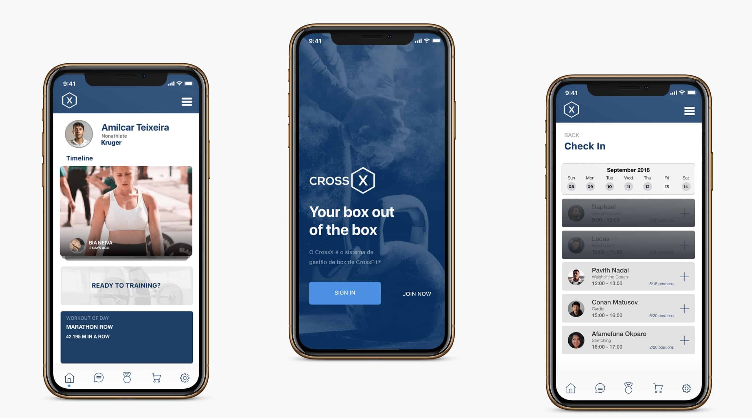
Cross X is an app designed to aid customers scheduling and registering for Crossfit classes. Besides its logistical functions, it also features an achievement bar where users can set goals and receive updates on their progress.

Responsibilities

User Research
Prototyping
UI

Project overview

What the expectations to accomplish.

Profiling the app user comprehending their reasons to do so and specifying their touch points. Additionally, to identify areas in which the application malfunction, impairing users from achieving their goals. The project objectives are: solving space problems, increasing accuracy on data management and  assuring the user an enjoyable experience.

Initial research

What the users do

With the voluntary support of a crossfit studio, we ran a experiment using the app. After observing several classes to understand the studio dynamic, we spoke with students in order to obtain an overview of their routines and demands.

User research

What the users say

A digital survey was prepared and sent out to the students. The questions were directed at understanding their use of the application and how it fits into their routines. The general response was that the great majority of users seldom schedule their classes, let alone using an app to do so. Some of the received comments highlighted hectic routines in which planning ahead or scheduling had little space. And it was exactly this lack of organization that had been imposing major logistical problems to the studio.

Personas

Who are the users and what's your journey

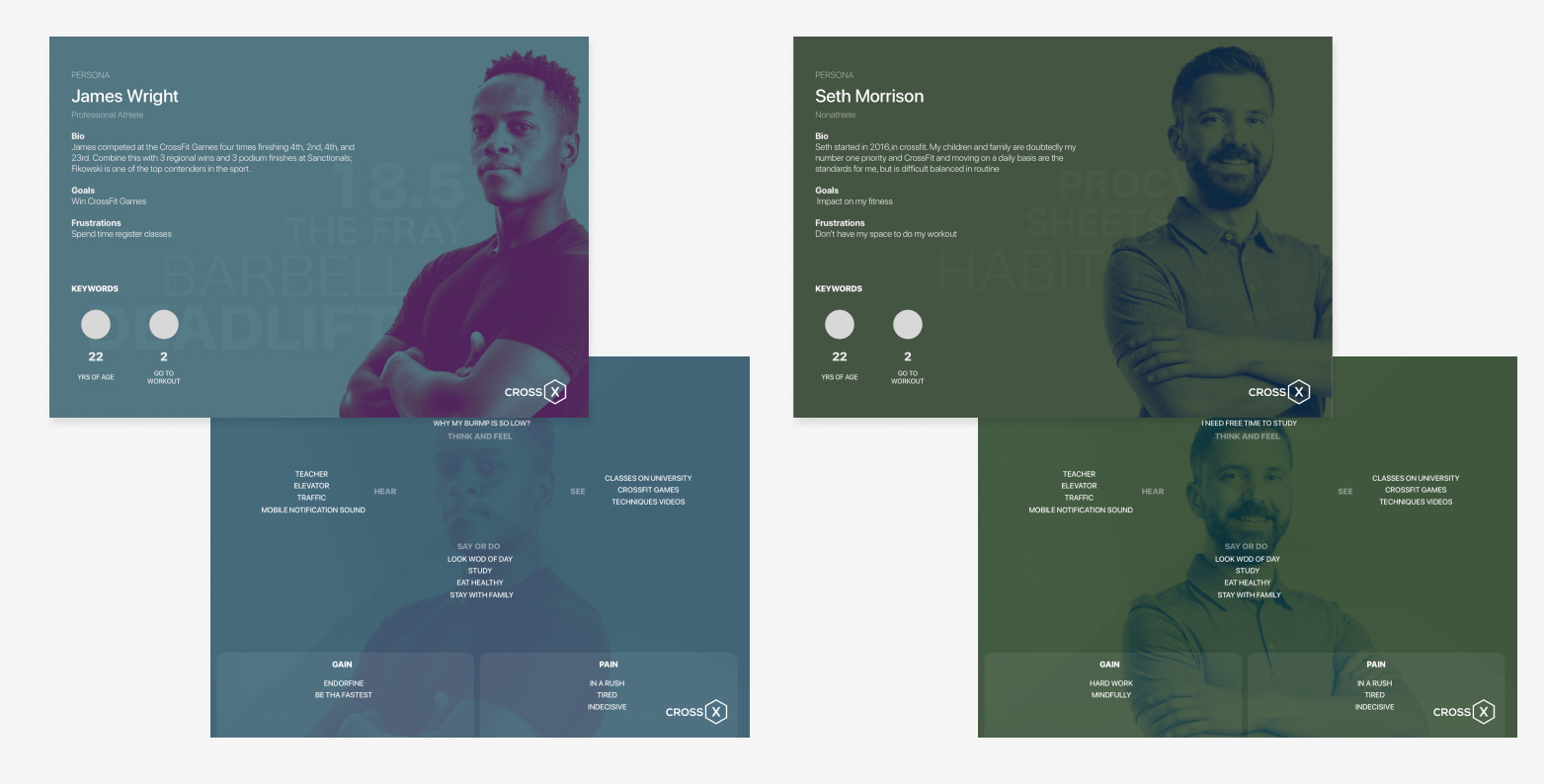
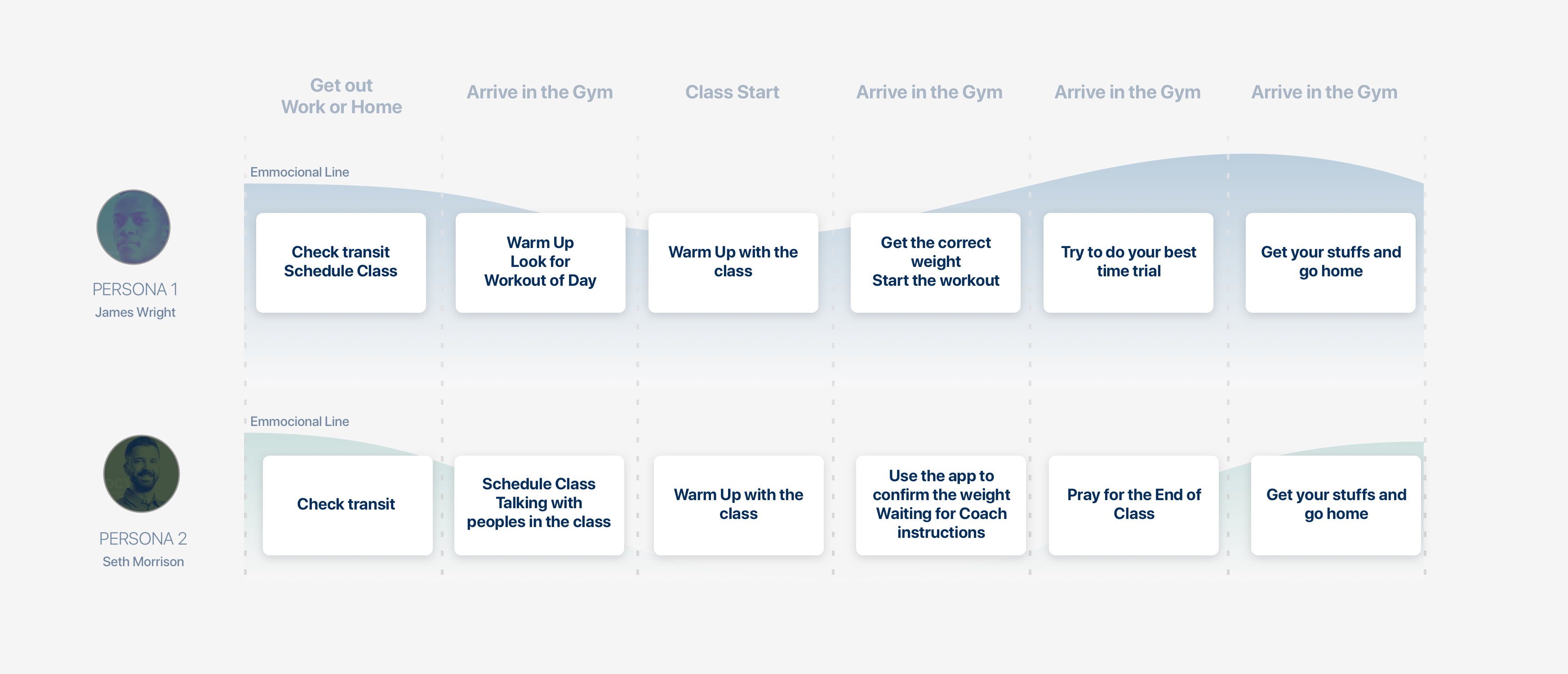
After the interview and with the survey responses, we profiled two personas, the athlete and non-athlete. Seeking for deeper understanding, we analyzed the pain points of their development.
Insight collections

Feature prioritization

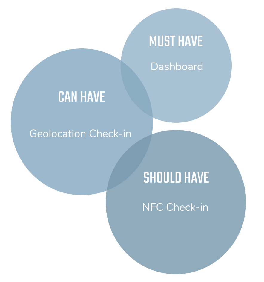
First post-its session was aimed at understanding the user’s background, general behaviour and feelings.Applying the affinity mapping  method to group possible solutions for the product. We used MosCoW to prioritize what features needed to be designed.

Must have: Dashboard
Should have: Geolocation Check-in
Could have: NFC Check-in

Solution

Designing the minimal solution
Dashboard

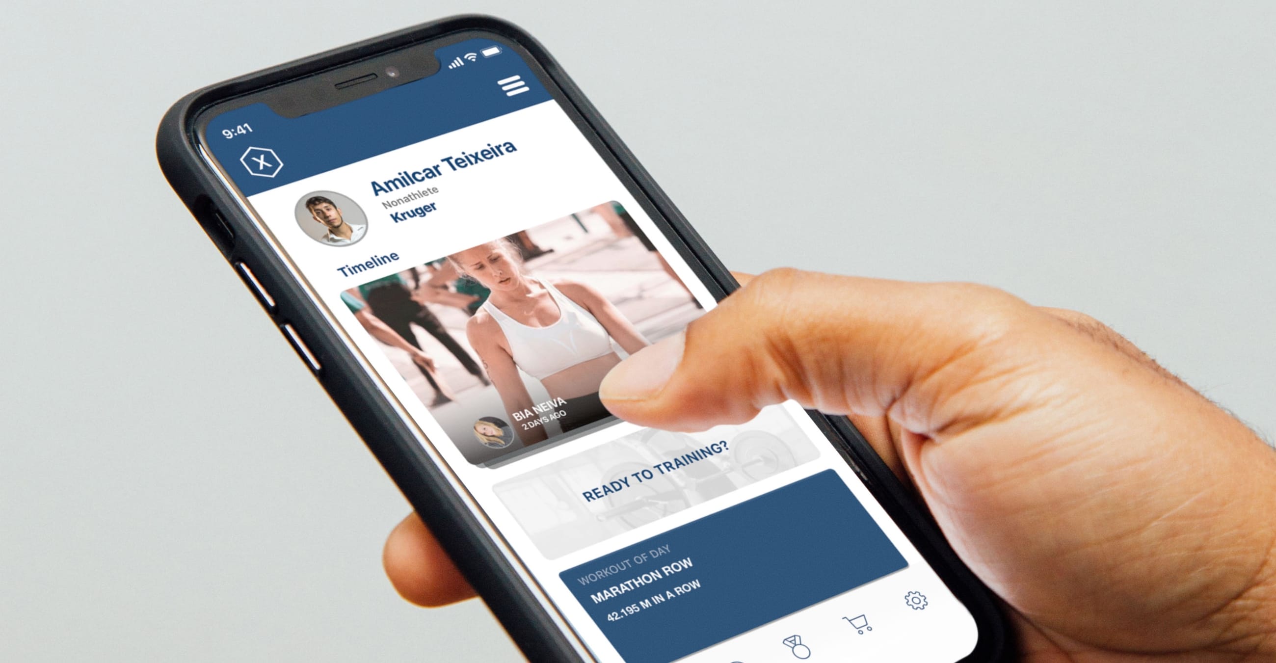
Just as on “prioritizing”, the first feature we worked on was the homescreen. By moving hidden key functions to the homescreen we created a dashboard appearance that enhanced visibility and reduced the time spent on navigation, therefore increasing engagement.

Check-in with
Machine Learning

The solution found to the check-in problem, considering the user's frequency and or location, was to modify the application to check for a confirmed scheduled workout; otherwise, send the user a notification. Based on the data, the app learns and refines the amount and sort of notifications the user receives.

What I've learned?

Reflecting back on the project.

My experience on this project again reaffirmed how essential it is to research before, during, and after the project. The best part being to make a positive difference on the user's routine.